The nutrition facts label on food items serves as a crucial resource, helping consumers make informed food choices about their dietary intake. This nutrition facts font and style guide offers direction to manufacturers on presenting fonts on these labels in a manner that’s both clear and enlightening to consumers.
These guidelines were built using expert advice and public feedback to ensure labels are easy for everyone to use. However, meeting all these specific requirements can be a challenge, which is why it’s important to use nutrition label maker software that is designed to automatically follow FDA rules for you.
With recent updates to the guidelines made in 2016, Food Label Maker streamlines the process for companies trying to satisfy these standards by ensuring that labels are both consumer-friendly and compliant. See our pricing and generate a nutrition label to get started.
See How FoodLabelMaker Can Help You
Key Takeaways
- Which font should you use on your nutrition facts label?
- The FDA’s stance on nutrition labels is clear: they should use a single, easy-to-read type style.
- The Helvetica font has become an industry benchmark style for food labels.
- What font size is required for the nutrition label?
- Font sizes vary depending on which element you are looking at on a nutrition label.
- The “Nutrition Facts” title font size has been increased for better visibility.
- “Servings per Container” now has a larger font size.
- Serving size and serving size amount are now more prominent and bold.
- Label size is determined by the size of the packaging, with larger packages requiring more prominent labels.
- The FDA recommends a linear or vertical format for most products, ensuring a logical flow of information.
- Alternative formats, like tabular or horizontal layouts, are available for specific packaging types or sizes
FDA Nutrition Label Size and Layout Requirements
The FDA’s labeling regulations have been updated as a result of its dedication to consumer clarity. While the primary goal remains to provide transparent and easily digestible information, the changes reflect a more modern understanding of nutrition and dietary needs.
Let’s delve into the new requirements, offering a comparative glance at the old versus the new.
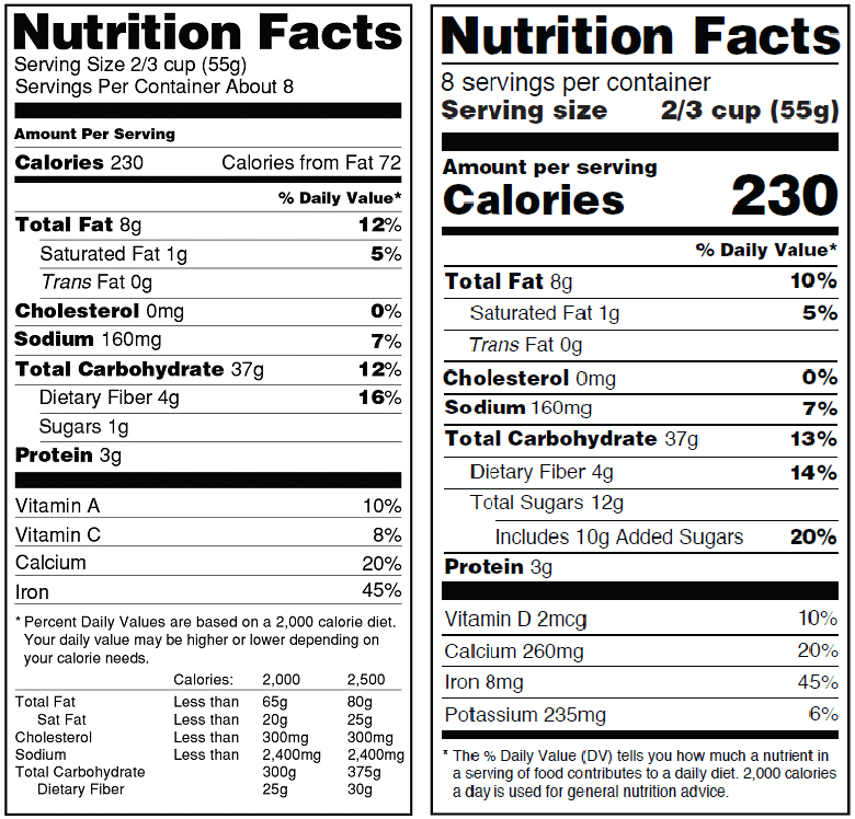
New FDA Nutrition Facts Label
Explore Food Label Maker’s templates, designed to automatically adjust font sizes and styles based on your product’s packaging size, simplifying the labeling process for businesses.
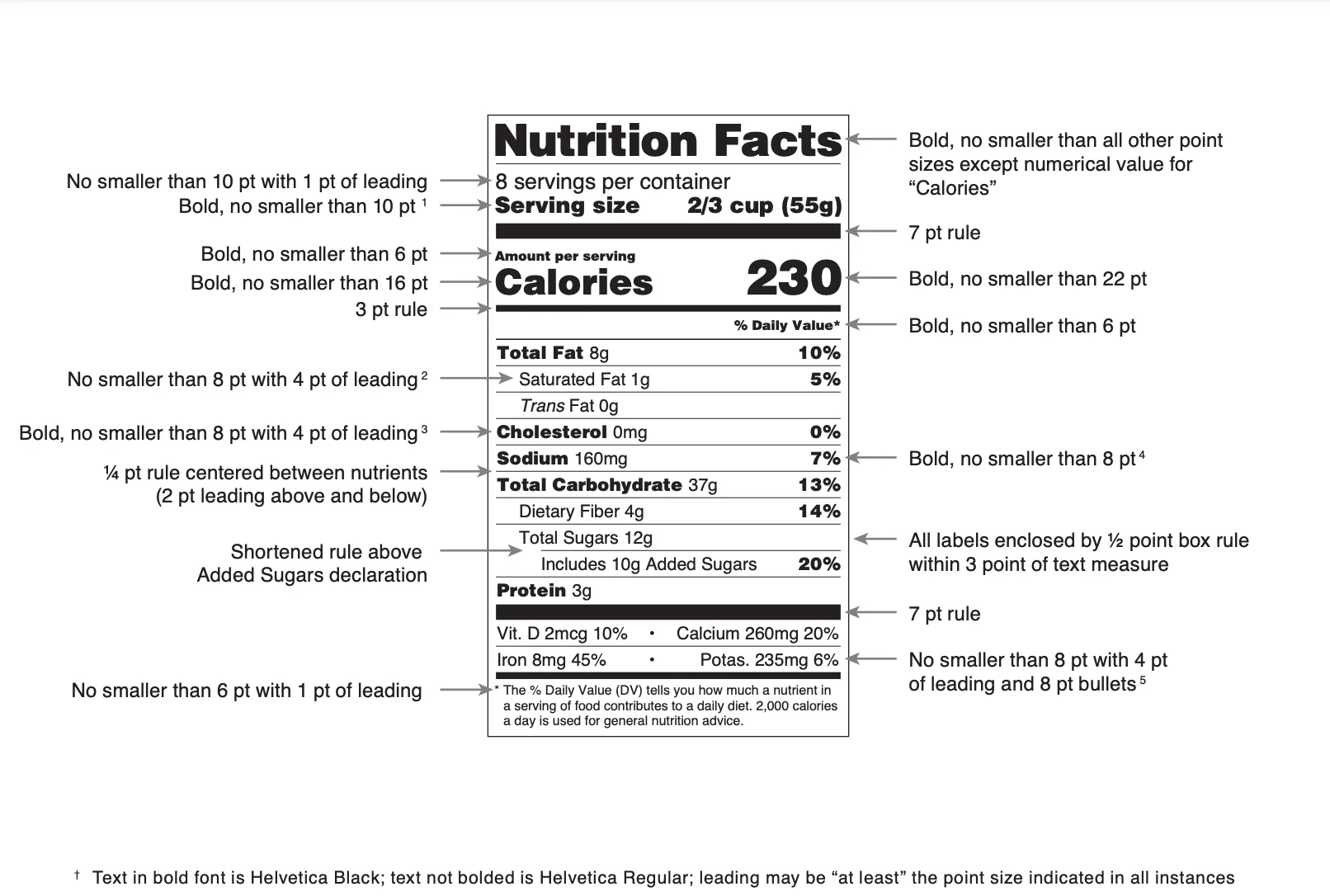
Nutrition Facts
- In the new labeling requirements, the “Nutrition Facts” font remains bold and prominent.
- Font size: bigger than all other point sizes on the nutrition label (excluding “Calories”)
- Previously, the font was smaller, but the FDA recognized the need for this section to stand out, making it easier for consumers to locate essential nutritional information.
Servings per Container
- The “Servings per Container” section has been bolded for increased emphasis in the new guidelines.
- Font size: no smaller than 10 point.
- The font size is larger than before, which makes it clearer for consumers to understand the number of servings they’re getting from a product.
Servings Size + Servings Size Amount
- The serving size and the serving size amount now use a more prominent and bold font.
- Font size: no smaller than 10 point.
- This change ensures that consumers can quickly gauge the quantity they’re consuming relative to the entire package, helping them make more informed dietary choices.
Amount Per Serving
- The “Amount Per Serving” section remains crucial, and its font size has been slightly increased in the new guidelines.
- Font size: no smaller than 6 point.
- This adjustment ensures that consumers can easily discern the nutritional value they’re getting per serving.
Calories
- Caloric content is often a primary concern for consumers. Recognizing this, the FDA has significantly increased the font size for “Calories,” making it one of the most noticeable sections on the label.
- “Calories” font size: no smaller than 16 points (though 10 points are acceptable for smaller packaging).
- Calories amount font size: no smaller than 22 point (probably the largest font size on the package).
- This change helps individuals quickly assess the energy value of their food choices.
%DV Heading
- The “% Daily Value” heading, often abbreviated as “%DV”, provides context for the nutrient amounts listed.
- In the new requirements, this section retains its importance with a bold, clear, and easily readable font.
- Font size: no smaller than 6 point.
- This ensures consumers understand the percentage of daily recommended intake.
Nutrients and %DV Value
- Each nutrient and its corresponding %DV value are now presented in a clearer and more organized manner.
- The font size remains easily readable, and the layout ensures that consumers can effortlessly correlate a nutrient with its %DV.
- Please refer to the graphic at the top of this article for more details regarding bolded amounts and recommended font size.
Footnote
- The footnote has always been a place for clarifying the context of the %DV values.
- In the updated guidelines, the footnote’s font is clear and legible, providing essential information about daily value percentages based on a 2,000-calorie diet.
- Font size: no smaller than 6 point with 1 point of leading.
By understanding these changes and ensuring compliance with FDA font size requirements, food manufacturers can provide consumers with the clarity they need while also meeting the FDA’s stringent standards.
Why Label Size and Layout Matter for Nutrition Labels
When it comes to FDA nutrition labels, label size and format play a critical role in ensuring consumer transparency and easy access to nutrition facts information. The FDA sets clear format requirements to help standardize how nutrition information is presented across packaged foods. This supports informed decision-making and reduces confusion on food packaging.
Label size is primarily determined by the physical dimensions of the package. Larger packages must display a more prominent nutrition facts panel so that key details, such as total fat, saturated fat, trans fat, sugars, protein, dietary fiber, and vitamins and minerals, are clearly legible at a glance. For a full breakdown of how to organize every part of your packaging beyond just the nutrition panel, see our fundamental guide to food labeling and packaging.
For smaller packages, the FDA allows certain layout adjustments, but minimum sizes and readability standards still apply to preserve clarity and accuracy. In some cases, there are even exemptions for nutrition labeling requirements, such as for low-volume products or small businesses.
Format is equally important. For the nutrition information panel, the FDA recommends linear or vertical formats for most products. This structure presents data in a logical sequence, beginning with serving size and calories, followed by nutrient content listed as a numerical value with corresponding % Daily Values. This familiar format helps consumers avoid common labeling mistakes and quickly scan nutrition facts information, compare products, and interpret health claims, such as low-fat or reduced nutrient content.
Alternative formats, including tabular or horizontal layouts, may be employed when space is limited. Regardless of the example chosen, all labels must maintain consistency, legibility, and compliance with FDA regulations. These format requirements ensure nutrition information remains accessible, reliable, and easy to understand, even as packaging sizes and designs vary.
Approved Font Standards for FDA Nutrition Labels
Typography is a foundational element of compliant nutrition labeling. The FDA mandates that all writing on the nutrition facts panel be clear, readable, and simple to read under typical usage circumstances, although it doesn’t specify a particular typeface. Fonts that are decorative, script, or stylized aren’t allowed since they can hinder clarity and make it harder for people to grasp.
Helvetica Regular has become the industry standard and is frequently used in FDA examples. Most manufacturers follow suit, using Helvetica Regular for standard text and heavier weights for emphasis. The “Nutrition Facts” heading must appear in the largest font on the label, while key nutrients—such as total fat, saturated fat, trans fat, sugars, protein, dietary fiber, vitamin D, and other vitamins and minerals—are presented in a structured, highly readable hierarchy.
Font size varies by element, but all text must meet FDA minimum sizes to ensure legibility across food packaging types. Numerical values, % Daily Values, and nutrient names must remain clear, even on smaller labels. Consistent spacing, alignment, and weight support quick scanning and accurate interpretation of nutrition information, reinforcing consumer trust and transparency.
Also, keep in mind that the FDA’s rules on style and size differ from those in other countries when it comes to labeling. Layouts may need to be changed for products sold in other countries to comply with local laws. For U.S.-packed foods, using FDA-approved fonts helps ensure labels are legal, easy to read, and aligned with what customers expect. It also lowers the chance of regulatory problems because of health claims or formatting mistakes.
Streamlining Label Creation with Nutrition Analysis Software
In today’s digital age, creating nutrition labels has become more streamlined and efficient, thanks to nutrition analysis software. These tools are designed to simplify the process of generating accurate and compliant nutrition labels.
- Accuracy and Compliance: Nutrition analysis software databases are often updated with the latest FDA guidelines, ensuring that the labels you generate are always compliant. They take into account the latest changes in requirements, such as the recent updates to font sizes and formats.
- Ease of Use: Most of these software solutions offer user-friendly interfaces. By inputting your product’s ingredients and quantities, the software can automatically calculate nutritional values, serving sizes, and daily value percentages.
- Customization: These tools often come with customization options, allowing brands to adjust labels to fit their packaging design while still adhering to FDA guidelines.
- Time and Cost Efficiency: Manual label creation can be time-consuming and prone to errors. Nutrition analysis software speeds up the process and reduces the risk of mistakes, potentially saving businesses both time and money.
- Updates and Notifications: As regulations evolve, these software solutions often send notifications or updates to users, ensuring they’re always informed about the latest requirements.
For businesses in the food industry, tools provided by companies such as Food Label Maker can be invaluable. They not only ensure compliance with FDA guidelines but also provide a seamless experience in label creation, allowing businesses to focus on what they do best: creating both delicious and nutritious products for consumers.
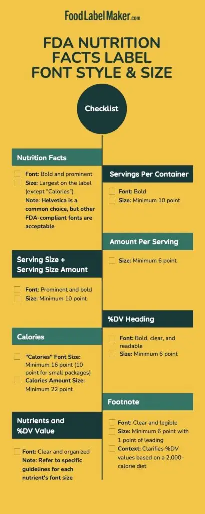
Download this checklist to determine whether you have followed the correct FDA standards for your nutrition facts label, or view Food Label Maker’s pricing plans to start creating your next food label.
Final Thoughts on FDA Nutrition Facts Font and Size
Getting nutrition facts font, size, and layout right is a core part of FDA compliance and consumer transparency. From using a clear, readable typeface like Helvetica Regular to meeting minimum font sizes for calories, nutrients, and % Daily Values, every detail of the nutrition facts panel is designed to help consumers quickly understand nutrition information and make informed food choices.
For food manufacturers, navigating these FDA regulations can feel complex, especially when balancing packaging constraints, health claims, and evolving labeling standards. Small errors in font size, hierarchy, or spacing can lead to compliance issues, delays, or costly revisions.
Food Label Maker simplifies this process by automatically applying FDA-approved font styles, sizes, and format requirements to your nutrition labels. Our platform ensures your labels meet current FDA guidelines while remaining clean, legible, and ready for market.
Ready to streamline your labeling workflow?
Generate a nutrition label with our tool to see how it works, or view our pricing plans to find the right solution for your business.

