The Nutrition facts label on food items serves as a crucial resource, helping consumers make educated choices about their dietary intake. The Nutrition Facts Font Style and Size Guideline offers direction to manufacturers on presenting fonts on these labels in a manner that’s both clear and enlightening for the public. This directive was formulated by the Food and Drug Administration (FDA), drawing insights from specialists in human usability and incorporating feedback from the broader community. To aid in this endeavor, nutrition label makers emerge as a solution that automatically adheres to FDA guidelines. Food Label Maker ensures that labels are not only compliant but also consumer-friendly, simplifying the process for businesses aiming to meet these standards. See our pricing and create a free nutrition label to get started.
With recent updates to the guidelines made in 2016, understanding the label font size and FDA font size requirements is more crucial than ever. This article aims to inform businesses and manufacturers about the nutrition label font used to ensure your product stands out while staying compliant.
See How FoodLabelMaker Can Help You
TLDR
- What font should you use on your nutrition facts label?
- The FDA’s stance on nutrition labels is clear: they should use a single, easy-to-read type style.
- The Helvetica font has become an industry benchmark style for food labels.
- What font size is required for the nutrition label?
- Font sizes vary depending on which element you are looking at on a nutrition label.
- The “Nutrition Facts” title font size has been increased for better visibility.
- “Servings per Container” now has a larger font size.
- Serving size and serving size amount are now more prominent and bold.
- Why did the FDA make calories bold and in larger font?
- The “Calories” section font size has been significantly increased and bolded so that it is legible, and easily identifiable, allowing a consumer to make an informed and better dietary decision.
- “%DV Heading” and “Nutrients and %DV Value” remain clear and easily readable.
- The footnote provides context for the %DV values and is clear and legible.
- Label size is determined by the size of the packaging, with larger packages requiring more prominent labels.
- The FDA recommends a linear or vertical format for most products, ensuring a logical flow of information.
- Alternative formats, like tabular or horizontal layouts, are available for specific packaging types or sizes.
- Nutrition analysis software can streamline the process of creating accurate and compliant nutrition labels.
- These software tools ensure labels are compliant with the latest FDA guidelines, and are user-friendly, customizable, and efficient.
- Tools like Food Label Maker are invaluable for businesses in the food industry, ensuring compliance and providing a seamless label creation experience.
- Food Label Maker simplifies the process of selecting the correct font and size for various sections of the nutrition label, making compliance straightforward.
Font and Rule Sizes for FDA Nutrition Labels
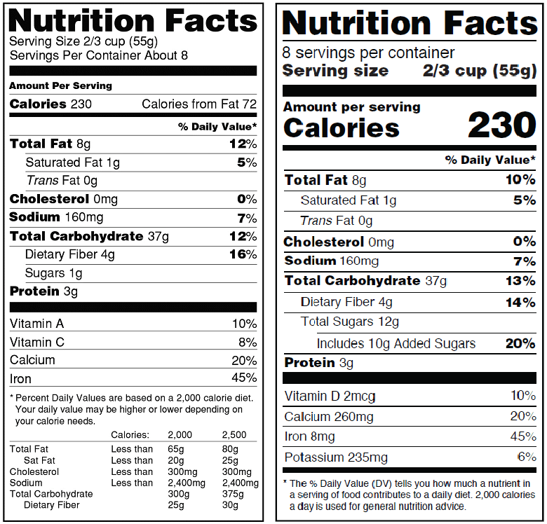
The FDA’s commitment to consumer clarity has led to a revamp of its labeling requirements. While the primary goal remains to provide transparent and easily digestible information, the changes reflect a more modern understanding of nutrition and dietary needs. Let’s delve into the new requirements, offering a comparative glance at the old versus the new.
Old vs. New Nutrition Facts Label

New FDA Nutrition Facts Label
Explore Food Label Maker’s templates, designed to automatically adjust font sizes and styles based on your product’s packaging size, simplifying the labeling process for businesses.

Nutrition Facts
- In the new labeling requirements, the “Nutrition Facts” font remains bold and prominent.
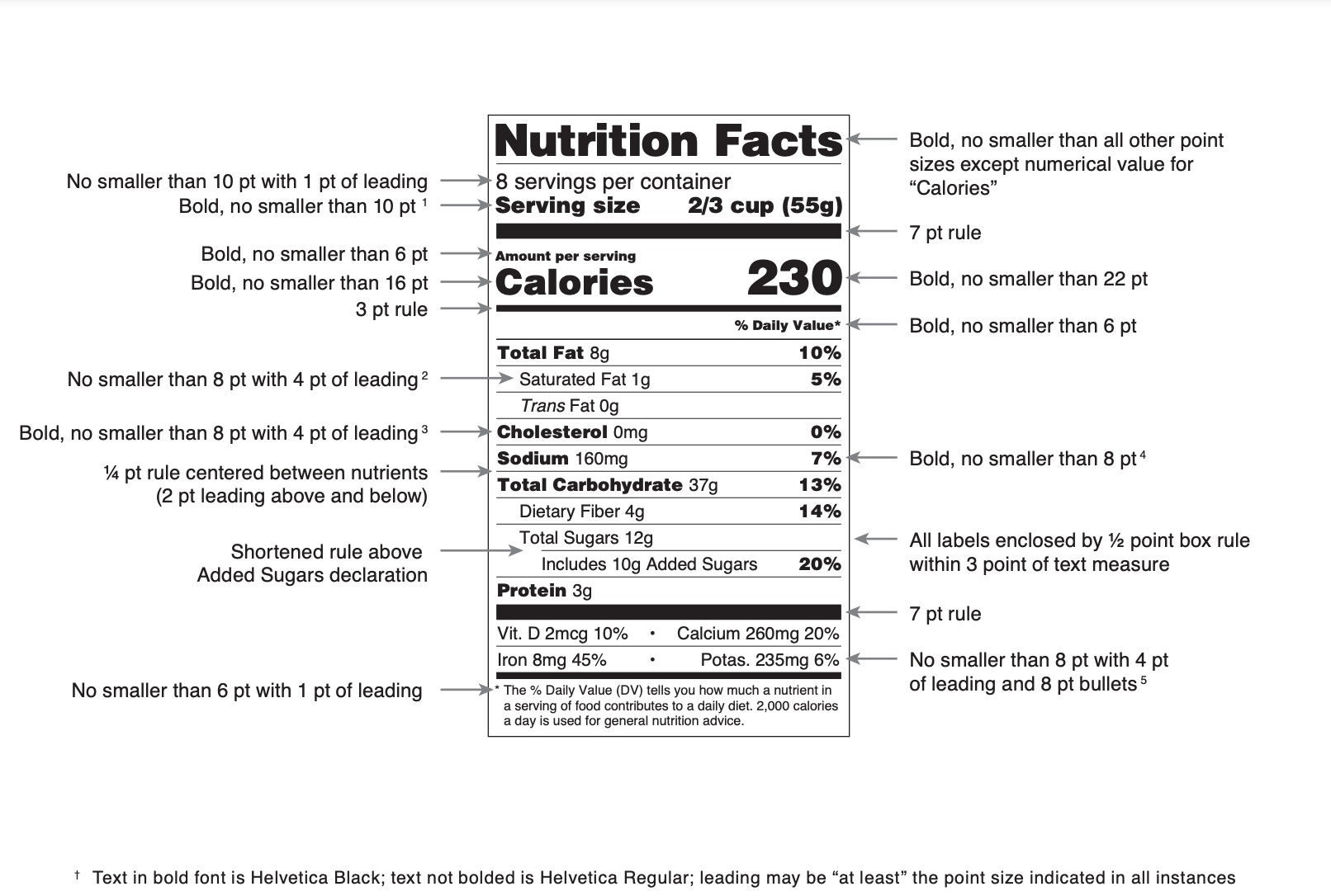
- Font size: bigger than all other point sizes on the nutrition label (excluding “Calories”)
- Previously, the font was smaller, but the FDA recognized the need for this section to stand out, making it easier for consumers to locate essential nutritional information.
- Many often wonder what font is used on nutrition labels. The FDA often showcases Helvetica in their sample labels, leading many manufacturers to adopt this font style.
- Consequently, Helvetica has emerged as an industry benchmark.
- While other fonts are entirely FDA-compliant, deviating from this norm might give labels a less conventional appearance.
Servings per Container
- The “Servings per Container” section has been bolded to give more emphasis in the new guidelines.
- Font size: no smaller than 10 point.
- The font size is larger than before which makes it clearer for consumers to understand the number of servings they’re getting from a product
Servings Size + Servings Size Amount
- The serving size and the serving size amount now use a more prominent and bold font.
- Font size: no smaller than 10 point.
- This change ensures that consumers can quickly gauge the quantity they’re consuming relative to the entire package, helping them make more informed dietary choices.
Amount Per Serving
- The “Amount Per Serving” section remains crucial, and its font size has been slightly increased in the new guidelines.
- Font size: no smaller than 6 point.
- This adjustment ensures that consumers can easily discern the nutritional value they’re getting per serving.
Calories
- Caloric content is often a primary concern for consumers. Recognizing this, the FDA has significantly increased the font size for “Calories,” making it one of the most noticeable sections on the label.
- “Calories” font size: no smaller than 16 points (though 10 points are acceptable for smaller packaging).
- Calories amount font size: no smaller than 22 point (probably the largest font size on the package).
- This change helps individuals quickly assess the energy value of their food choices.
%DV Heading
- The “% Daily Value” heading, often abbreviated as %DV, provides context for the nutrient amounts listed.
- In the new requirements, this section retains its importance with a bold, clear and easily readable font.
- Font size: no smaller than 6 point.
- This ensures consumers understand the percentage of daily recommended intake.
Nutrients and %DV Value
- Each nutrient and its corresponding %DV value are now presented in a clearer and more organized manner.
- The font size remains easily readable, and the layout ensures that consumers can effortlessly correlate a nutrient with its %DV.
- Please refer to the graphic at the top pf this article for more details regarding bolded amounts and recommended font size.
Footnote
- The footnote has always been a place for clarifying the context of the %DV values.
- In the updated guidelines, the footnote’s font is clear and legible, providing essential information about daily value percentages based on a 2,000-calorie diet.
- Font size: no smaller than 6 point with 1 point of leading.
By understanding these changes and ensuring compliance with FDA font size requirements, food manufacturers can provide consumers with the clarity they need while also meeting the FDA’s stringent standards.
Label Size and Format
When it comes to FDA nutrition labels, size, and format play a pivotal role in ensuring that consumers can easily access and understand the information presented. The FDA has set forth specific guidelines to ensure uniformity and clarity across all food products.
The label’s size is often determined by the size of the packaging. For larger packages, the label must be more prominent, ensuring that the information is easily readable from a distance. Conversely, for smaller packages where space is limited, certain allowances are made, but the emphasis remains on clarity and legibility.
The format of the label is equally crucial. The FDA recommends a linear or vertical format for most products. This layout ensures that the information flows logically, starting with serving details, followed by caloric content, and then breaking down into individual nutrients. The vertical format is familiar to most consumers and allows for quick scanning and comprehension.
However, there are alternative formats available for specific packaging types or sizes. For instance, tabular or horizontal layouts might be used for products with limited vertical space. Regardless of the chosen format, the key is consistency, legibility, and adherence to FDA guidelines.
Streamlining Label Creation with Nutrition Analysis Software
In today’s digital age, creating nutrition labels has become more streamlined and efficient, thanks to nutrition analysis software. These tools are designed to simplify the process of generating accurate and compliant nutrition labels.
- Accuracy and Compliance: Nutrition analysis software databases are often updated with the latest FDA guidelines, ensuring that the labels you generate are always compliant. They take into account the latest changes in requirements, such as the recent updates to font sizes and formats.
- Ease of Use: Most of these software solutions offer user-friendly interfaces. By inputting your product’s ingredients and quantities, the software can automatically calculate nutritional values, serving sizes, and daily value percentages.
- Customization: These tools often come with customization options, allowing brands to adjust labels to fit their packaging design while still adhering to FDA guidelines.
- Time and Cost Efficiency: Manual label creation can be time-consuming and prone to errors. Nutrition analysis software speeds up the process and reduces the risk of mistakes, potentially saving businesses both time and money.
- Updates and Notifications: As regulations evolve, these software solutions often send notifications or updates to users, ensuring they’re always informed about the latest requirements.
For businesses in the food industry, tools provided by companies such as Food Label Maker can be invaluable. They not only ensure compliance with FDA guidelines but also provide a seamless experience in label creation, allowing businesses to focus on what they do best: creating both delicious and nutritious products for consumers.
Download this checklist to determine whether you have followed the correct FDA standards for your nutrition facts label, or view Food Label Maker’s pricing plans to start creating your next food label.


