In recent updates made to the Official Mexican Standard (NOM), significant changes have been made to the label design requirements for food products in Mexico. These revisions aim to enhance the visibility and comprehension of nutritional information and warning symbols on packaged foods. The most important updates include specifications on the font size, color, and mandatory placement of front-of-package (FOP) warning symbols which warn consumers of excess levels of sugars, sodium, and fats in their food products.
In addition, nutritional declarations must now follow a standardized format so that all labels are consistent and clear. This article will explain these recent regulatory changes and specifically examine the changes in font, color, and symbol placement, and how they impact label design.
TLDR
- Updated Label Regulations: Mexico’s revised Official Mexican Standard (NOM) has introduced specific layout requirements for food labels to enhance readability and compliance so that consumers can make informed choices quickly.
- Layout Specifications: Labels must feature proportionate sizes for warning symbols and nutritional panels. They must also have clear fonts, and high-contrast colors for visibility and readability.
- Font and Color Guidelines: The text must stand out against its background, especially for warning labels where white text on a black background is mandated.
- Placement of Elements: Warning symbols should be placed prominently on the front of the food package, typically in the top right corner. Nutritional declarations are usually on the back or side in a logical format that starts with major nutrients.
- Label Design Tips:
- Font and Color: Choose legible fonts and ensure high contrast between text and background.
- Arranging Content: Position the product name prominently at the top or center, list ingredients in descending order by weight on the back, and arrange nutritional information next to the ingredient list for easy comparison.
- Nutrition Label Templates:
- Standard Nutrition Facts Label: Includes comprehensive nutrient details with amounts per serving and daily value percentages.
- Linear Nutrition Facts Label: Presented in a simplified, horizontal layout for products with limited packaging space.
- Dual Column Nutrition Facts Label: Provides a detailed comparison of nutrients per serving and per package, ideal for multi-serving products.
- Technology for Compliance: Utilizing platforms like Food Label Maker can streamline the creation of compliant labels, reduce errors, save time, and ensure consistency across products.
Understanding Label Layout Requirements
The latest regulations on food labeling in Mexico, particularly under the revised Official Mexican Standard (NOM), include specific layout requirements for nutrition facts labels. These are important for compliance with industry standards and consumer information.
The regulations specify that all packaged food products must display certain nutritional information and warning symbols in a standardized layout. These changes enhance the readability and effectiveness of food labels so that consumers can make informed choices quickly and easily.
Key elements of the layout include:
- Size: The warning symbol and nutritional information panel must be proportionate to the packaging size, ensuring that they are always visible and legible.
- Borders and Background: Warning labels must have a distinct black octagonal border with a contrasting background, typically white. This ensures that the text within is very visible.
- Font Size: Although there is no minimum font size regulation for both the nutritional information and warning symbols, the text needs to be large enough that it is legible from a reasonable distance. This means that the consumer won’t have to squint or struggle to read the contents without close inspection.
- Font Type: The font used on the labels must also be a font that is clear and easy to read, and in a majority of cases is the Ariel font. You should avoid using stylized fonts so that all letters and numbers are distinguishable to prevent confusion or misinterpretation.
- Color: The use of high-contrast colors is important for readability. For warning labels, the use of a black background with white text is the norm as the high contrast draws attention and makes the warnings more visible. This is essential for consumers who may be in a rush and need to make quick decisions.
See How FoodLabelMaker Can Help You
Placement of Warning Symbols and Nutritional Declarations
The warning symbol must be prominently placed on the front of the package so that you can easily see it when the product is displayed on shelves. It should also not overlap with other essential information or imagery that could distract from its visibility and impact. In most cases, the warning symbol is placed on the top right-hand corner of the front face of the package, where they are most likely to catch a consumer’s eye immediately.
Nutritional declarations are usually placed on the back or side of the package but should be formatted in a clear and easy-to-read manner. The information should also be organized logically, starting with the most important nutrients like calories, fats, sugars, and sodium. Each nutrient must be listed with its quantity per serving and, if applicable, its percentage daily value (%DV). The layout should be placed in a way that allows consumers to quickly compare nutrients and understand the nutritional composition at a glance.
Step-by-Step Guide to Designing Compliant Labels
Selecting the Right Font and Color
Choosing the correct font and color for your labels is not only a matter of aesthetic preference but is necessary for compliance. Fonts should be Sans-Serif or Ariel, as these are generally easier to read, and must be of a size that ensures legibility for all consumers, including those with visual impairments. The color contrast is also regulated, with a strong emphasis on ensuring that the text stands out against the background. For warning symbols, a stark contrast of white text on a black octagonal background is mandatory. For general nutritional information, using black text on a white or neutral background is advisable to enhance readability.
Arranging Content on the Label
- Product Name: This should be the most prominent element on the front of the package. Place it centrally or at the top, ensuring it is immediately identifiable.
- Ingredients List: Typically positioned on the back of the package, the ingredients list should be in descending order of predominance by weight. The font should be smaller than the product name but still clear and legible.
- Nutritional Information: This section should be adjacent to the ingredient list and formatted in a consistent, easy-to-compare manner as stated by the regulatory standards.
Mexico Nutrition Label Templates
Standard Nutrition Facts Label
The Standard Nutrition Facts Label in Mexico includes information on calories (energy), proteins, total fats, saturated fats, trans fats, cholesterol, carbohydrates, dietary fiber, total sugars, added sugars, and sodium. The layout is structured to ensure each nutrient is easily readable, with its amount per serving and percentage of the daily value based on a standard diet. The label on the right represents the Spanish-English label format.
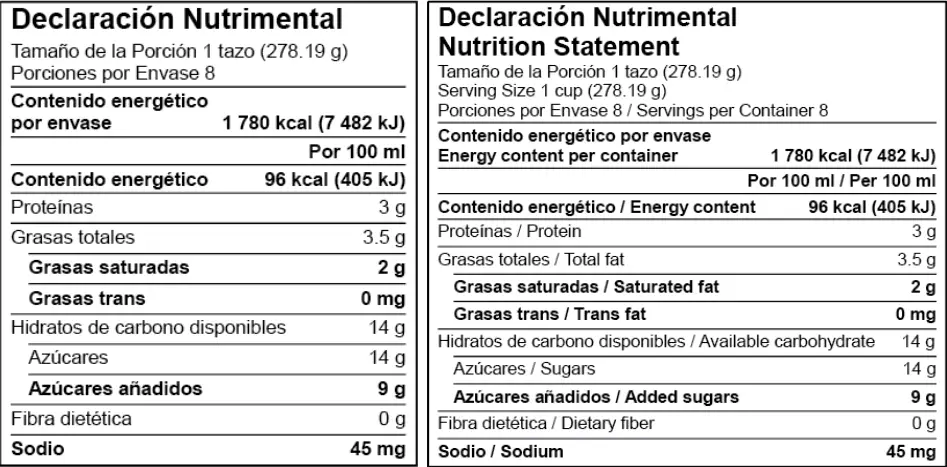
Linear Nutrition Facts Label

The Linear Nutrition Facts Label in Mexico is simpler and is used on products with limited package space and can’t fit a standard nutrition label on it. This format also includes essential nutrients such as calories (energy), proteins, total fats, saturated fats, and sodium. Each nutrient is listed with its corresponding amount per serving, making it easy for consumers to assess the nutritional value of the food product at a glance. The second label below the first one represents the Spanish-English label format.
Dual Column Nutrition Facts Label

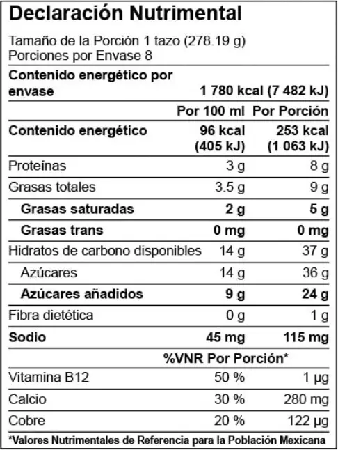
The Dual Column Nutrition Facts Label in Mexico is designed to offer a detailed comparison of nutrient content per container and per serving. This label format is useful for products that may be consumed in multiple sittings. It includes a comprehensive list of nutrients such as energy (calories), proteins, total fats, saturated fats, trans fats, cholesterol, carbohydrates, dietary fiber, total sugars, added sugars, and sodium. The dual-column approach allows consumers to easily understand the nutritional impact of consuming a single serving versus the entire package and highlights more informed dietary choices.
Leveraging Technology for Efficient Compliance
Companies that offer nutrition label software like Food Label Maker simplify the process of creating compliant labels under Mexico’s updated nutrition labeling regulations. Users can input their product information, and the software automatically calculates nutrient values and formats the information according to the latest guidelines, reducing the potential for human error. Here are a few more benefits of using their software:
- Reduces Errors: By automating calculations and label formatting, Food Label Maker minimizes the risk of errors that might occur with manual label design. This precision is crucial for compliance, especially with the stringent new regulations in place.
- Saves Time: The streamlined process offered by Food Label Maker allows producers to generate labels much faster than traditional methods. This efficiency is ideal for businesses with large product lines or those needing to update labels regularly in response to recipe changes.
- Consistency and Compliance: With preset templates that adhere to the latest regulations, users can rest assured that every label is consistent and compliant. This uniformity is important for maintaining brand integrity across many different products.
Using platforms like Food Label Maker can help businesses adapt to new regulatory environments more efficiently, ensuring that their products remain competitive and compliant in the marketplace.

Related Posts